HKSA Designs
Branding, Apparel Design

Overview
Branding and merchandise design
The Problem
The client's previous logo was intricate and detailed, making it difficult for the target audience to recognize at smaller scales.
Research + Ideation
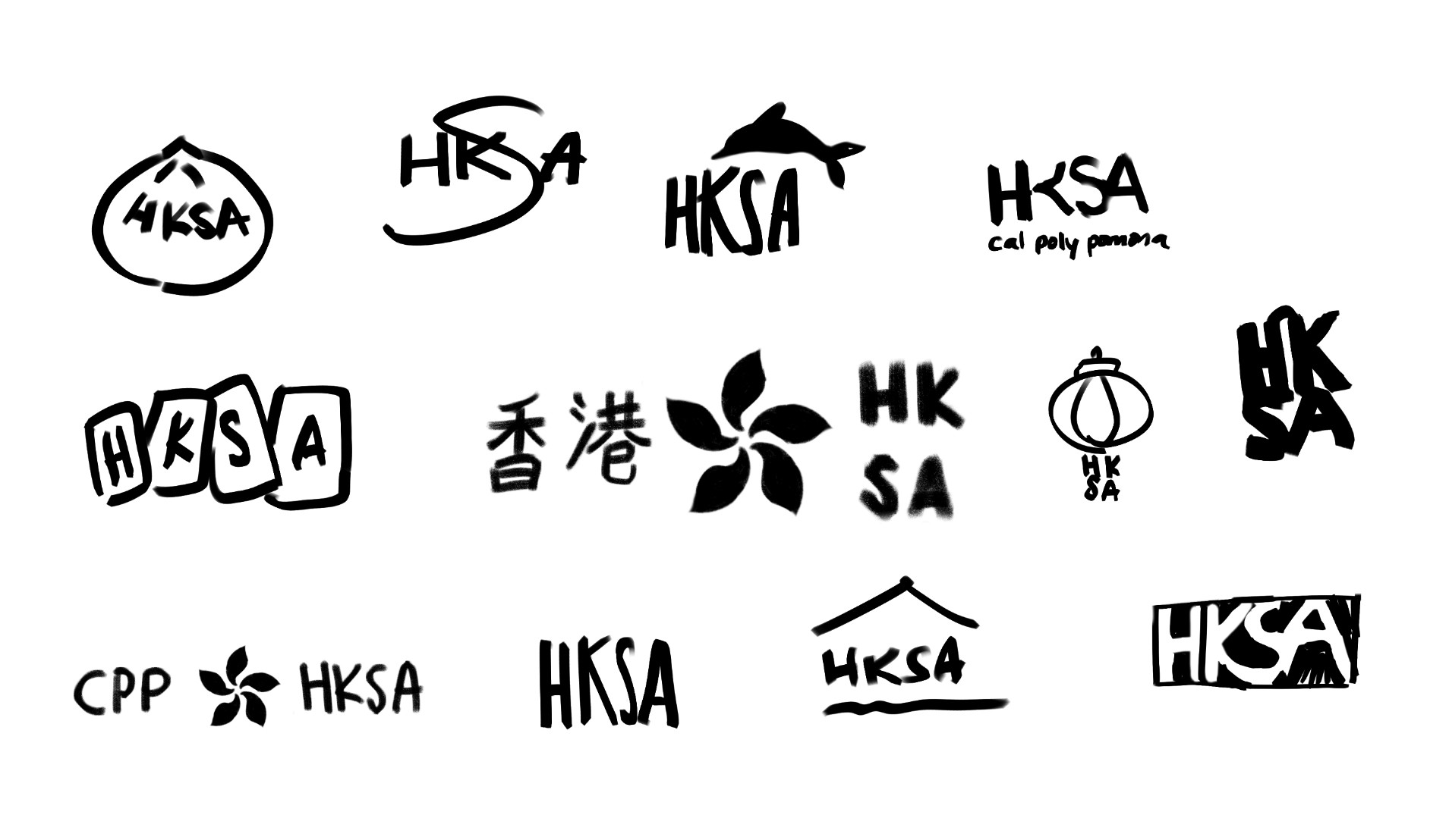
After researching, I developed sketches to represent the culture and history of Hong Kong.
Client Feedback
After the initial thumbnail sketches of the logo, the client decided on the flower concept. From there, I created iterations to explore different logo layouts

Client Decision
From the 5 refined logo designs, the executive board casted their votes to decide which logo they preferred. The client decided on the top right logo after various vote sessions.
Visual Identity
I established a consistent visual identity focusing on brand recognition and clarity.
The branding takes inspiration from Hong Kong's flag, which features the country flower. The logo features a simplified version of this flower to prioritize readability.


2024 – 2025 HKSA Apparel Design
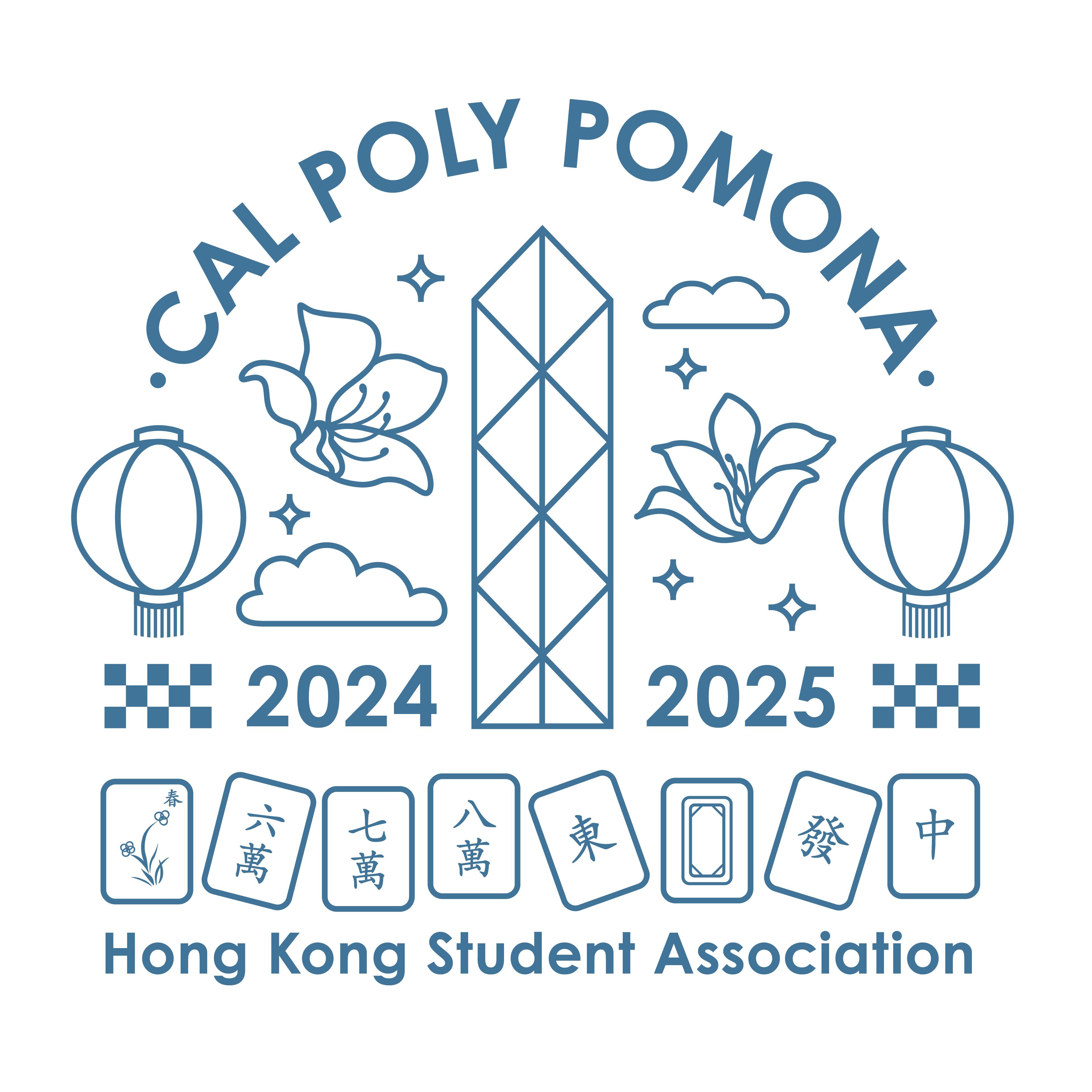
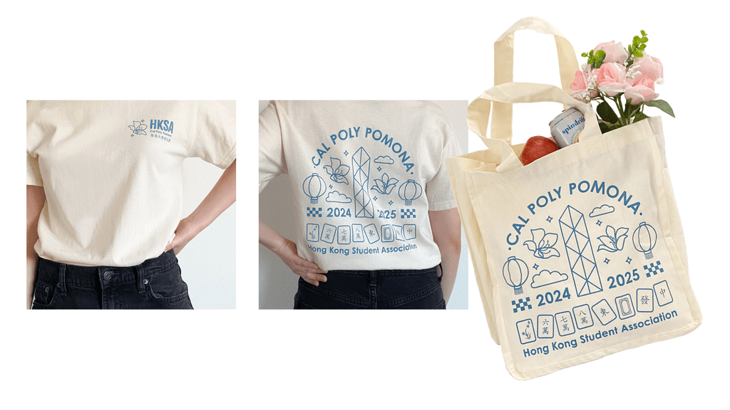
Designed promotional t-shirts and tote bags for the Hong Kong Student Association, a club at California State Polytechnic University, Pomona. Every school year, a new t-shirt design is selected.
The graphics take inspiration from Hong Kong culture and local attractions
My designs contributed to a 200% increase in merchandise sales.