CraftiBuy App
UX/UI Design, Research, Branding, User Testing


Overview
CraftiBuy is a marketplace app that allows users to browse and shop for handmade arts and crafts, and support local business.
Client
CraftiBuy
The Problem
Current arts and crafts marketplaces are cluttered and do not display information clearly, making it difficult for customers to view details of a product.
This causes a frustrating experience for customers and makes them more doubtful about making a purchase.
Research
Upon interviewing 8 people from ages 18-25, statistics revealed that:
75% were hesitant when purchasing items online due to uncertainty in sizing and product quality
87% valued transparent store policies
75% expected responsiveness from the stores they contact
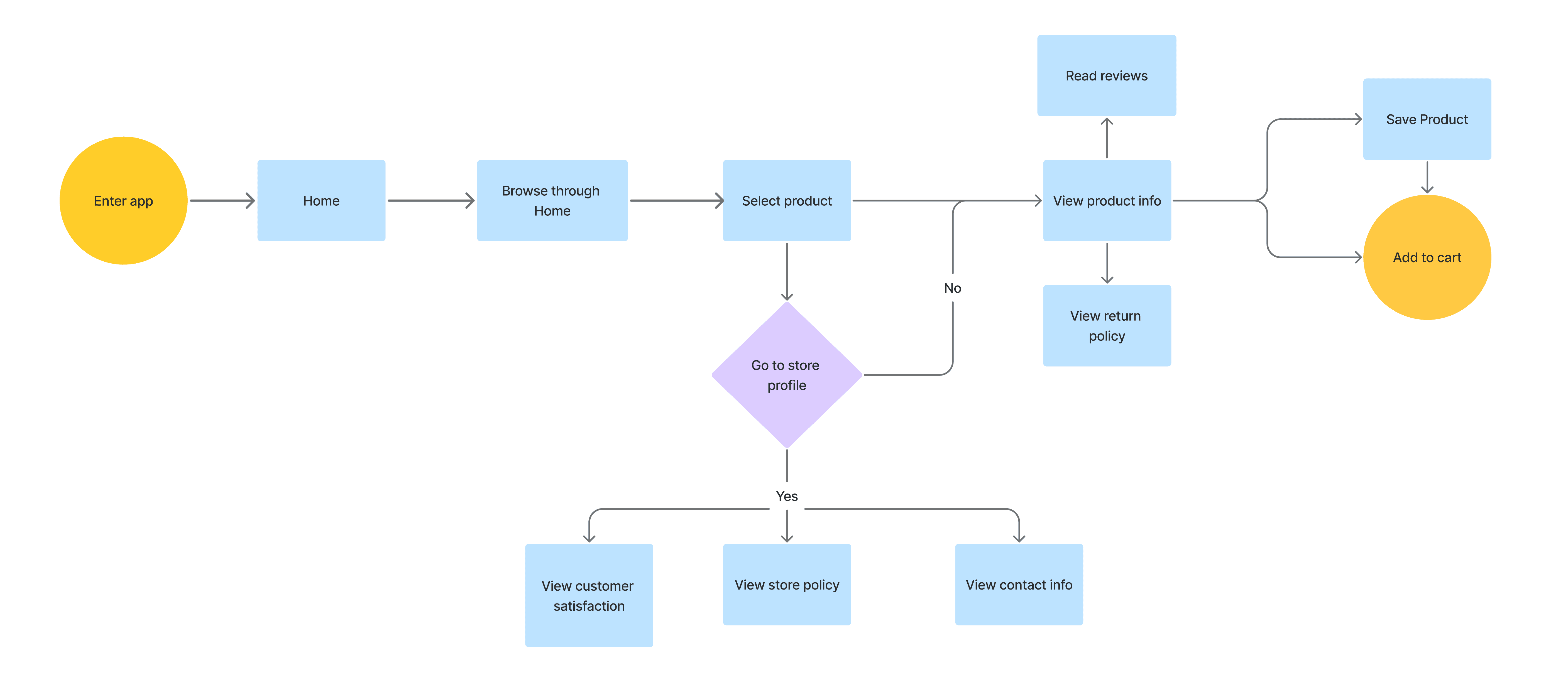
User Flow
From the research gathered, I created a user flow to envision the path a user takes to view product and store information
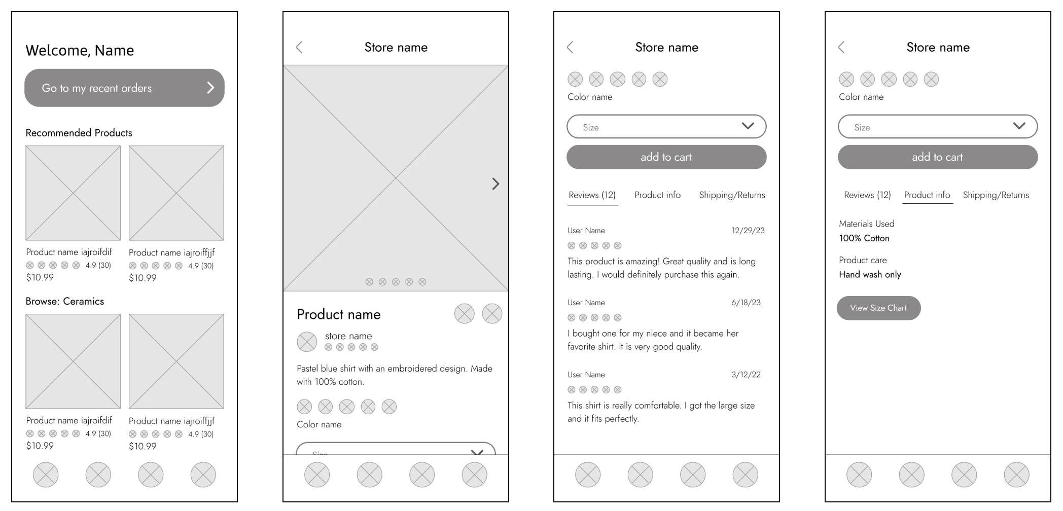
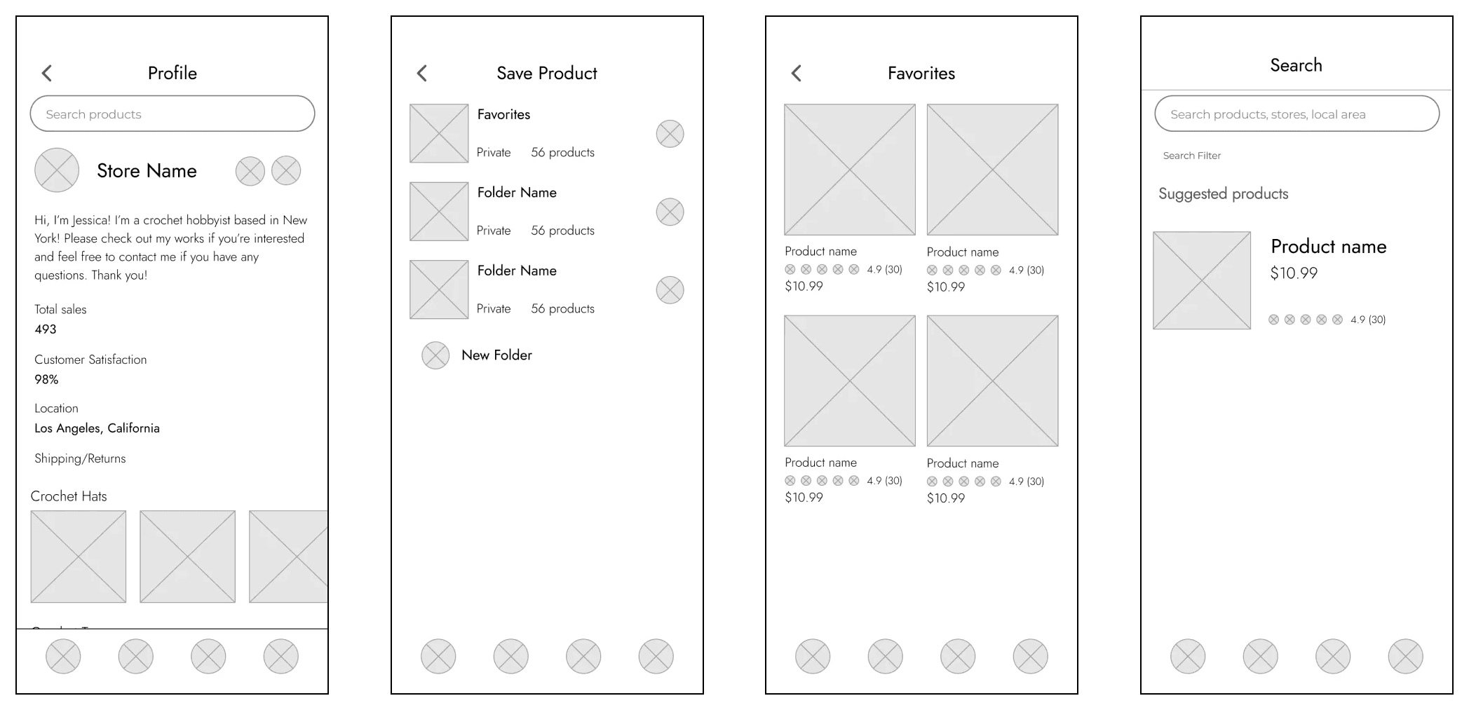
Low Fidelity Wireframes
To prioritize readability of information, my wireframes focused on organization of elements.
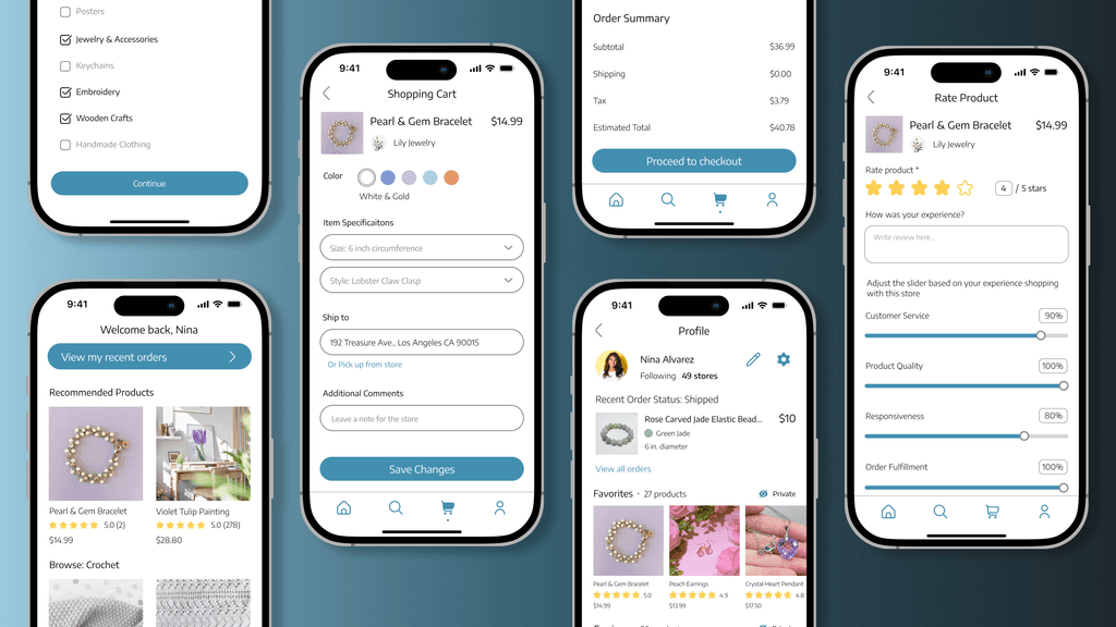
The Solution
Prioritize hierarchy of information and organization.
This provides a straightforward way for users to view details about listings and sellers, eliminating confusion and doubt.
Collapsible Lists
Collapsible lists were utilized to organize seller details, such as detailed customer satisfaction data, contact information, and store policy.
This approach increased clarity and minimized clutter.
Tabs
Tabs were chosen to divide product listing information into three major sections: Reviews, Product Info, and Shipping/Returns.
With tabs, all the information could be stored on one page without being overwhelmed seeing all the product information at once.
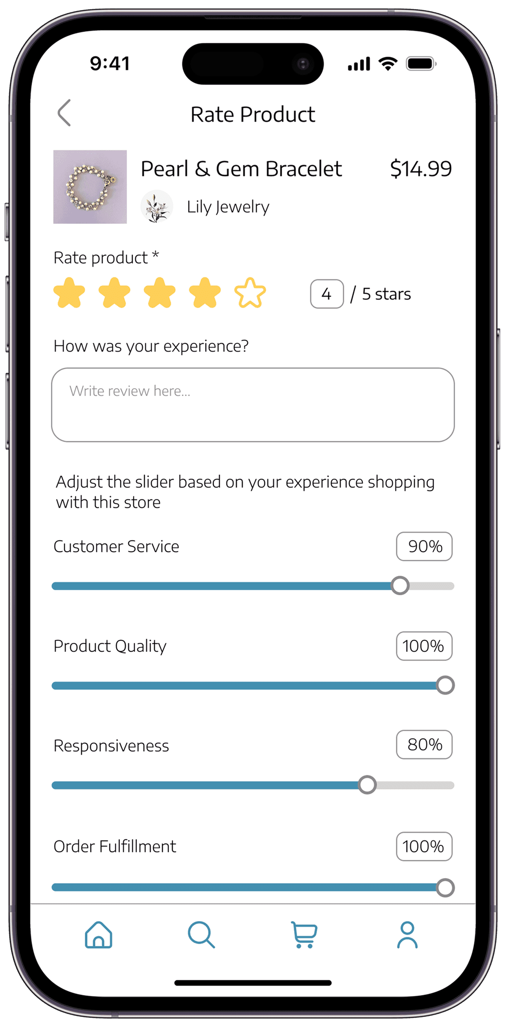
Accesibility
Multiple methods of input
When rating a product, users are given multiple methods of inputting their ratings. They are given the option to tap to interact with the stars and sliders, or input a number into the text field.
Takeaway
Through this project, I realized the importance of having a well planned out user flow to identify the logistics of specific user paths.